Project
Rossdale Art Supplies
Role
UX/UI Design
Agency
JTB
Type
Digital Product, eCommerce
Sector
Retail, eCommerce
Overview
Rossdale is the leading Australian wholesale distributor of arts and crafts. Starting as a small paint brush manufacturer in the 1940s, Rossdale has a legacy within the industry and was in need of a website that would showcase this history. An improved stockist ordering experience was also to be realised through a new digital ecosystem, integrating with their backend system and warehousing technologies.
Challenge
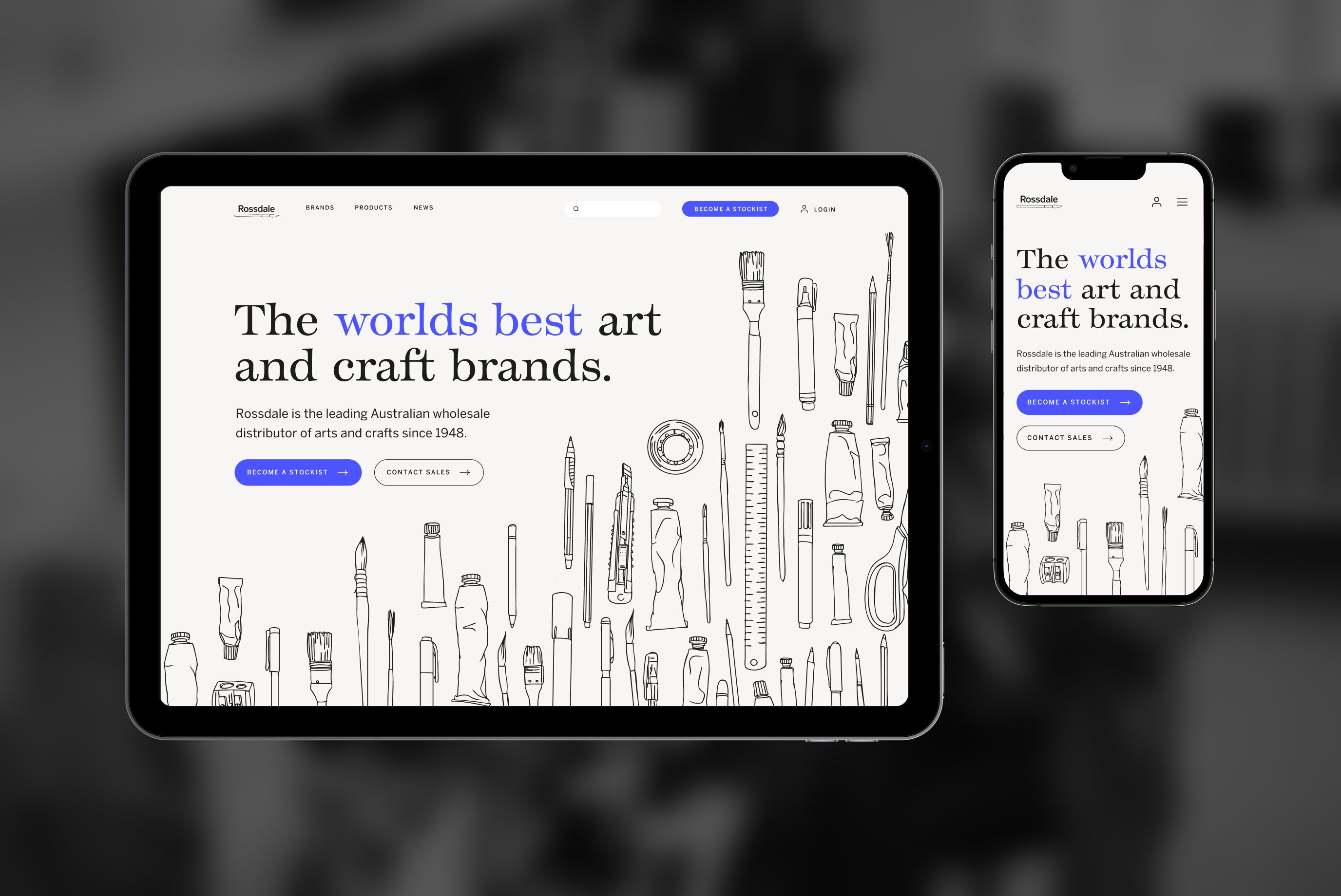
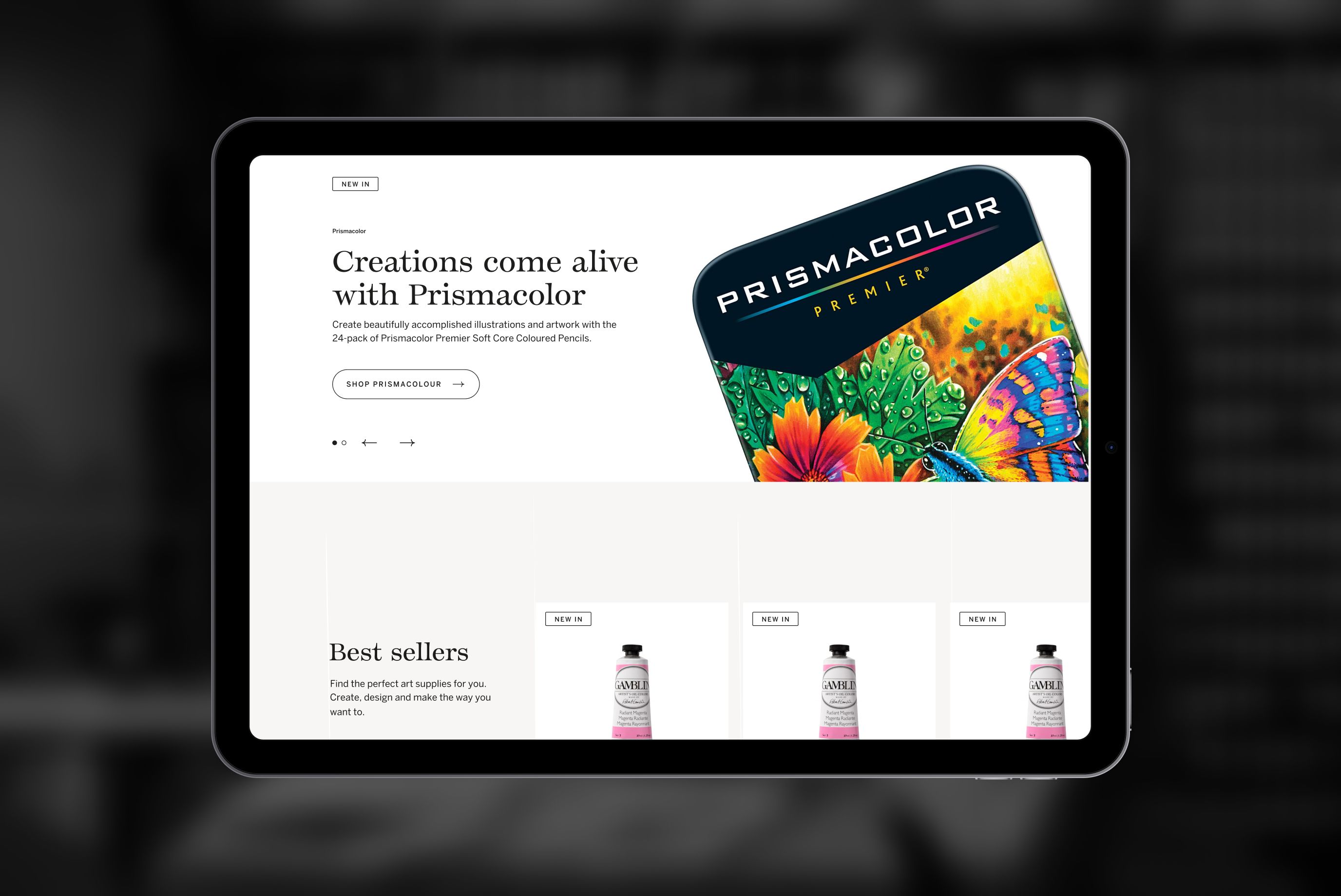
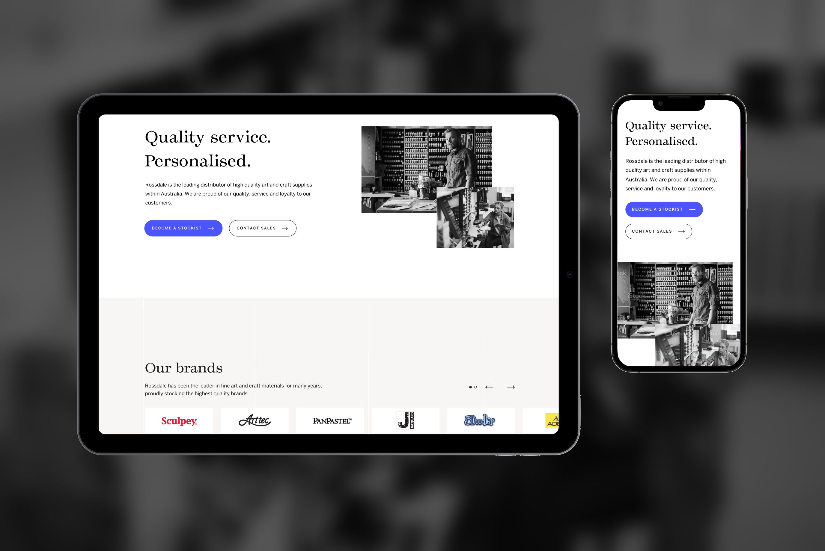
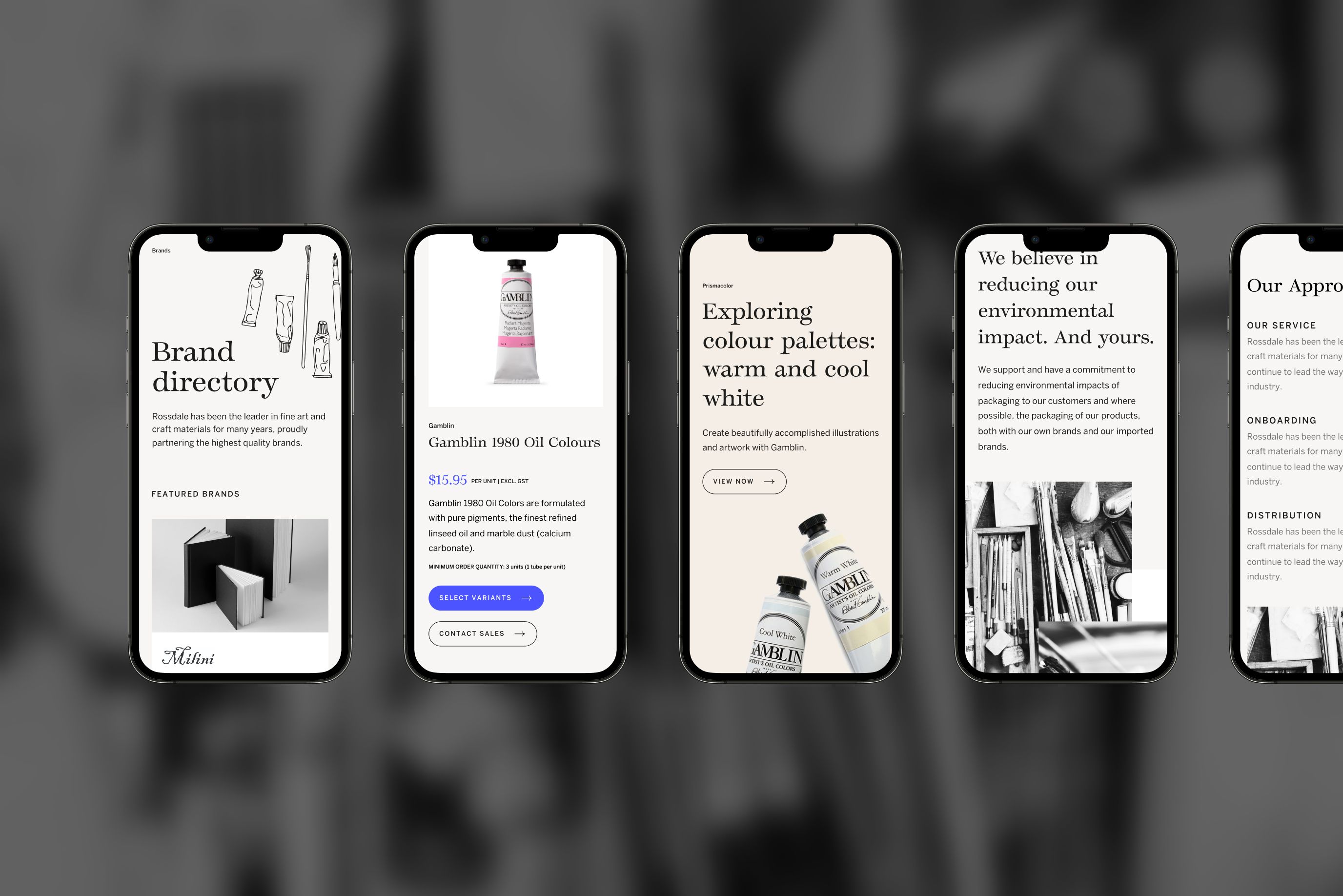
One of the core challenges faced within the project was showcasing the sophistication and history of Rossdale through a front-facing website. Potential stockists were to understand Rossdale, their history and offering with ease. Products and brands that Rossdale distributed were also to be showcased.
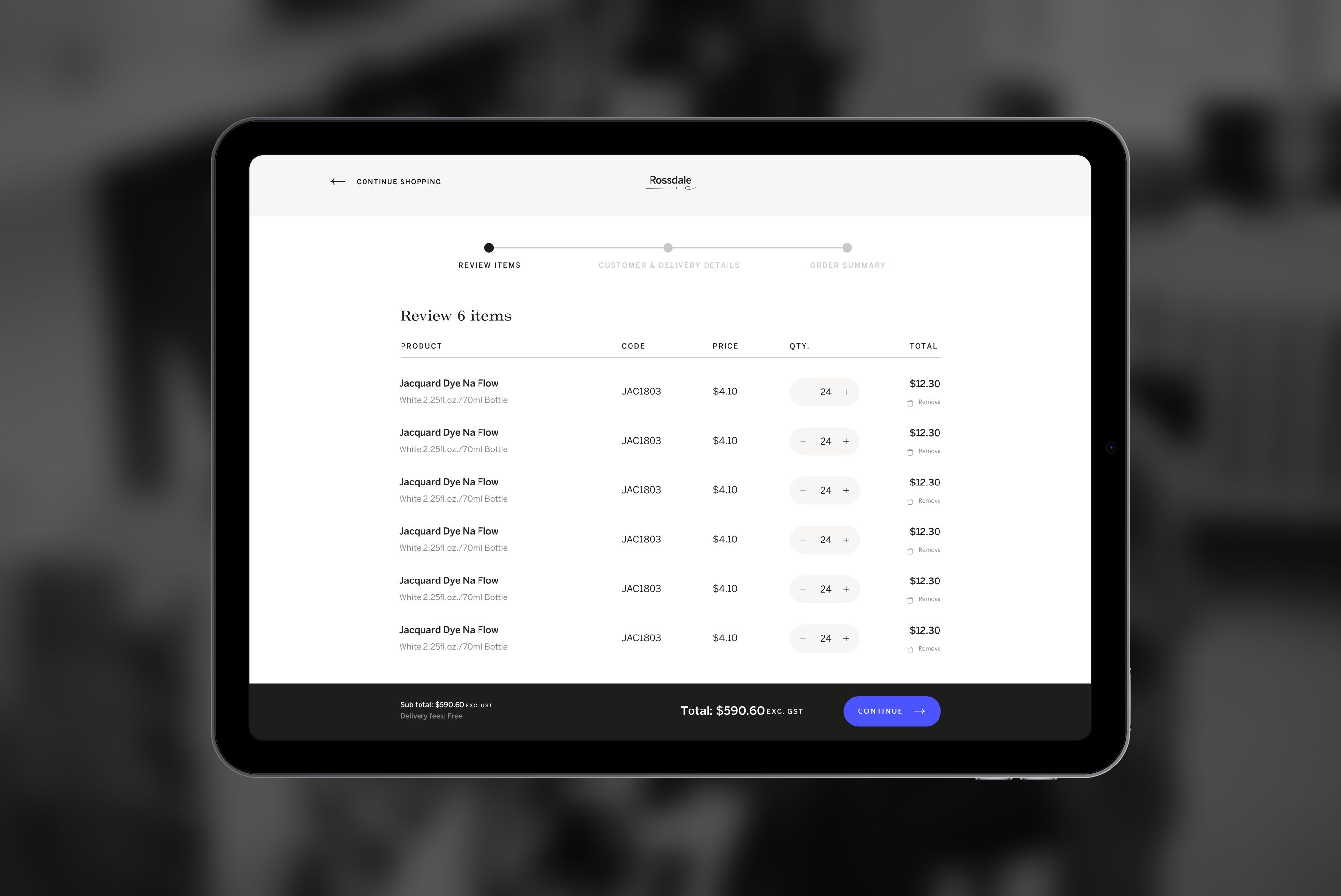
The digital ecosystem was to also be reconsidered, moving from a time-intensive, manual approach to an automated custom solution. At the core, stockists needed to be able to manage their orders and accounts while minimising the time spent on each task.
Outcome
Designing the UX strategy required working closely with the Rossdale team to understand their current operations; including the order processing, fulfilment and dispatch. This allowed for the definition of the vision, objective and measurable goals to be established.
Onboarding of stockists needed to be simple, where users could partner with Rossdale simply through a lead generation form. This streamlined the onboarding process for the Rossdale operations team and minimised time spent on manually registering stockists and creating accounts.
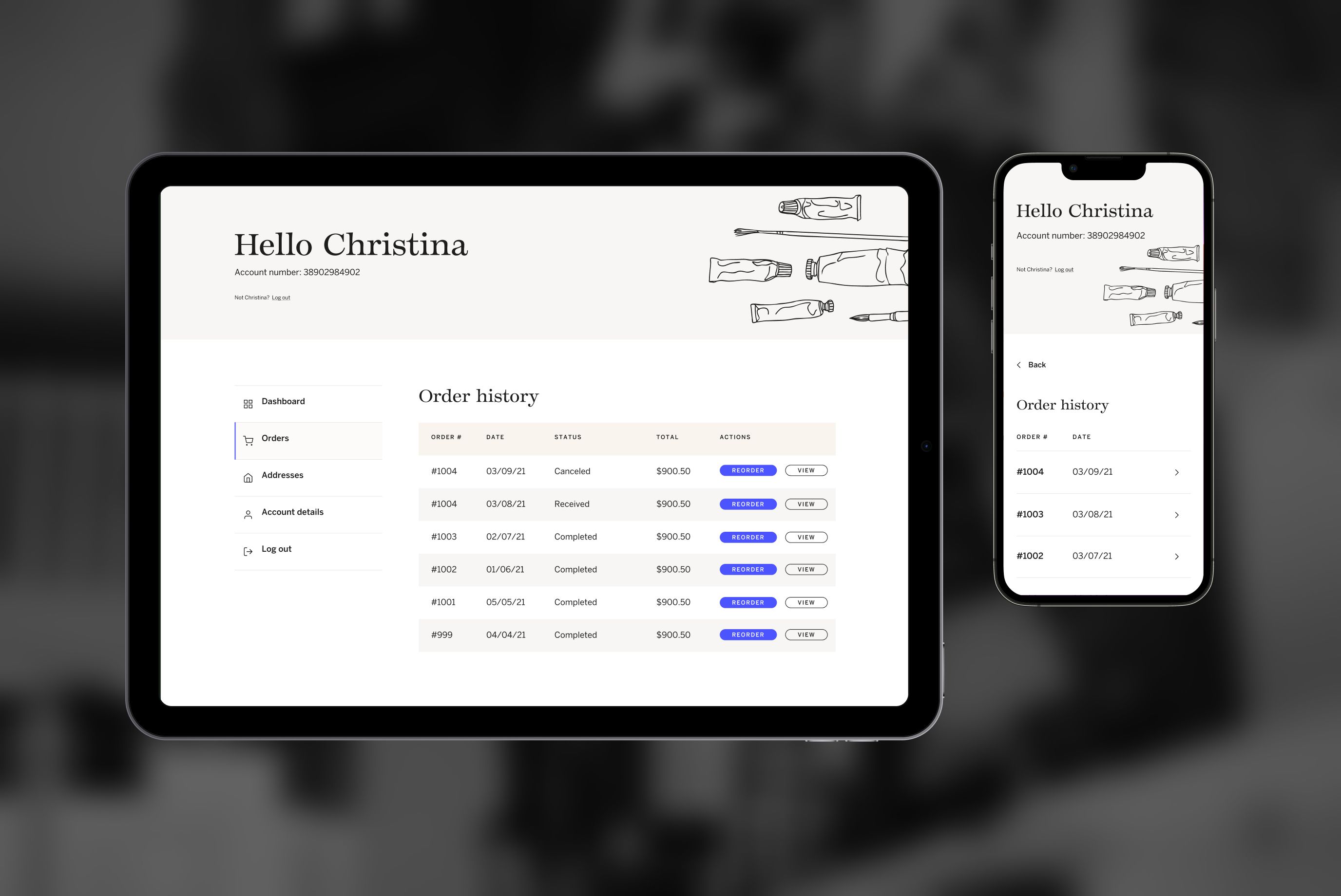
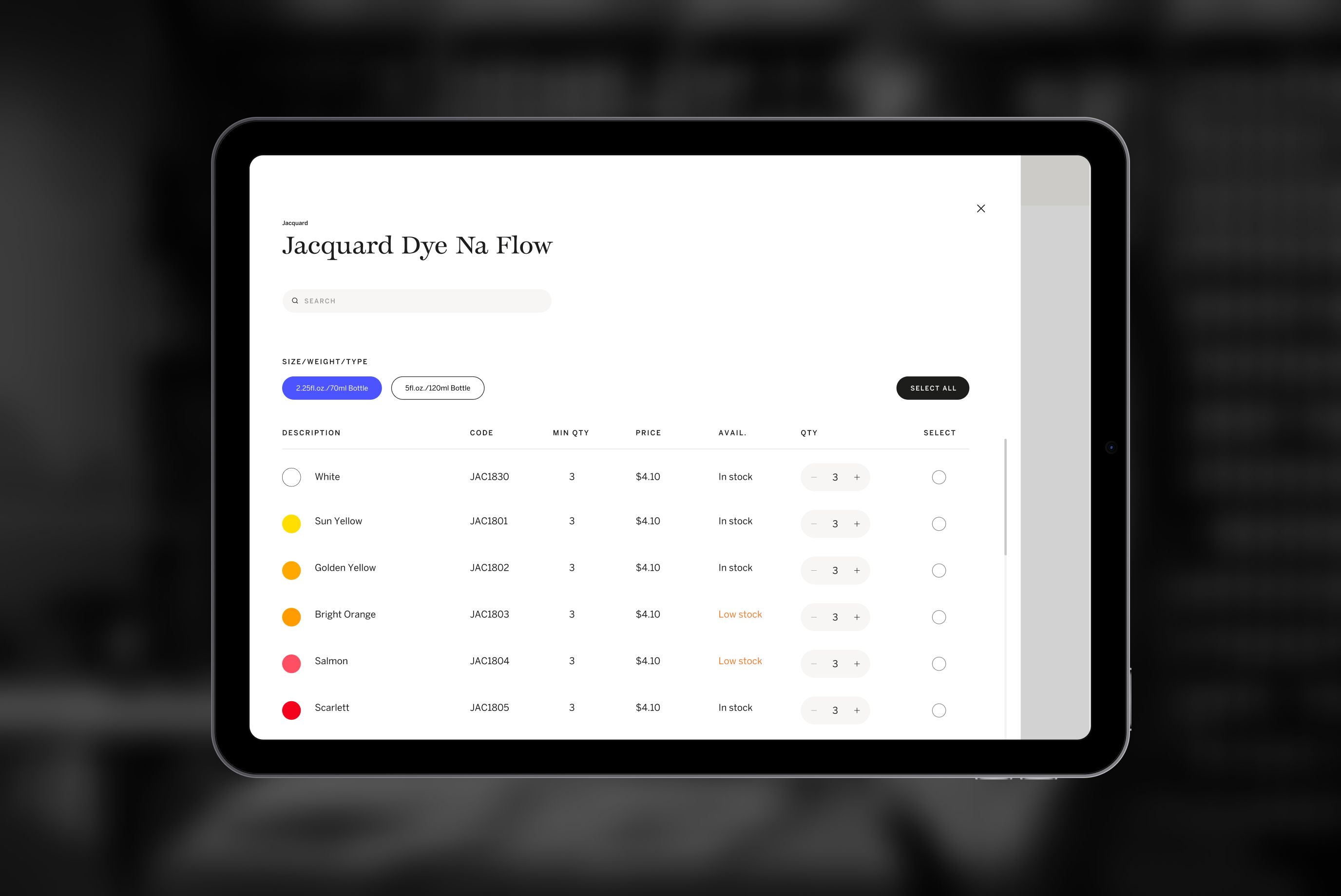
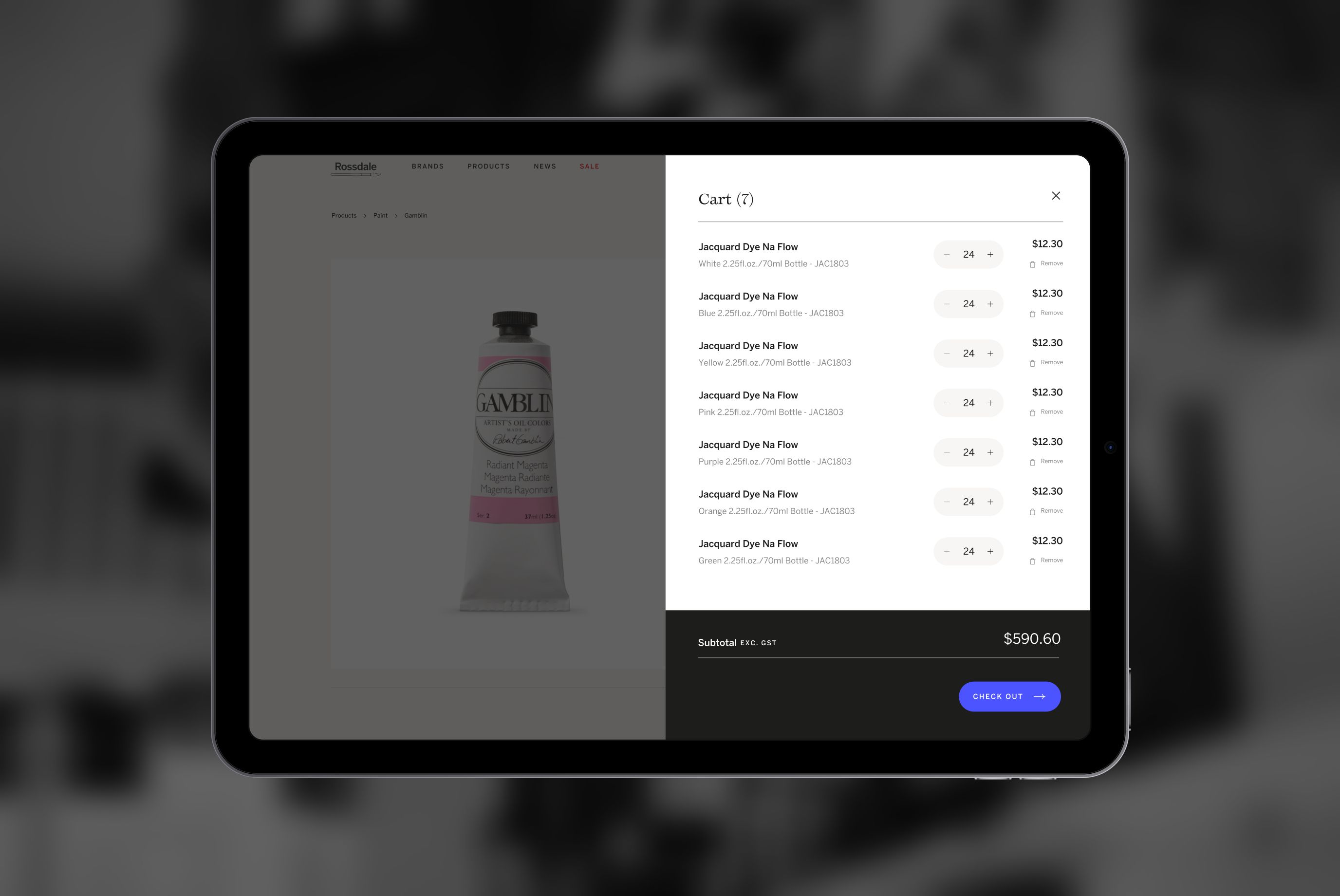
The comprehensive catalogue of products was made available online. Users were provided with powerful search and filtering capabilities within the ordering system, reducing the need to remember product codes, colour codes and titles of thousands of products. The user was also armed with the ability to simply hit ‘reorder’, a key feature in reducing manually creating orders.
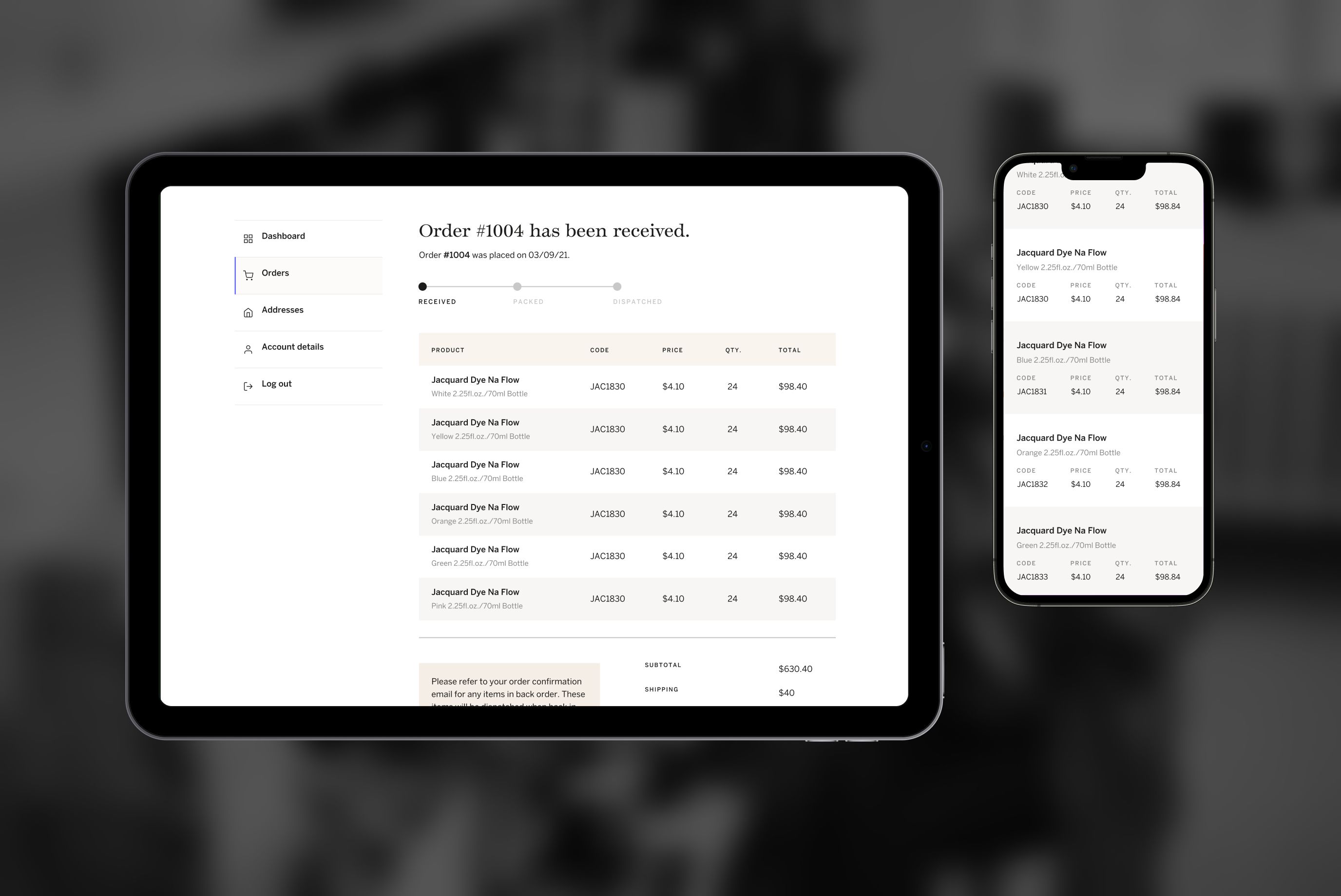
Users were also armed with real-time information about the status of their orders through the integration of warehousing technology.
Visually, the approach was to be sophisticated yet paired back, allowing the products and processes to take the limelight. With a lean budget for creative and slim resources for future-proofing, editable content was kept to a minimum. Lasting illustrations were baked into the creative execution, giving a clear nod to the distributor's product.
